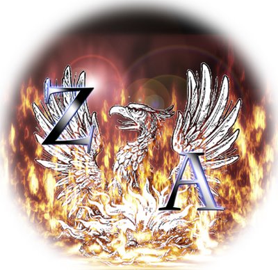
First DRAFT!!!
Id post the full size image up here but its 2400x2400 Pixels...
What do u think?
THoughts?
Findings?
Everything i have made froms cratch, except the bird...
if it was a coloured bird i think it might look better, eitherway the edges need to be cleaned up...

ALso.
Anyone that says making decent looking flames is easy...
Is wrong.
Im thinking either a faded circle like so, or a fade out to a black square. (that might not make sense... its cool.)

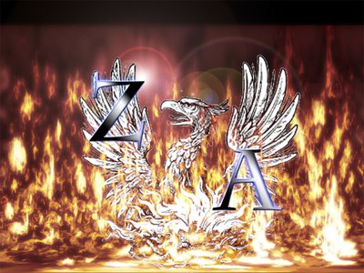
Heres a desktop sized version... if u want.
What do u think?
THoughts?
Findings?
Everything i have made froms cratch, except the bird...
if it was a coloured bird i think it might look better, eitherway the edges need to be cleaned up...

ALso.
Anyone that says making decent looking flames is easy...
Is wrong.
Im thinking either a faded circle like so, or a fade out to a black square. (that might not make sense... its cool.)

Heres a desktop sized version... if u want.


2 Remarks:
mmm yeah thats it baby...
yeeah
daddy like...
*coff coff*
i mean
cool.
I prefer ze top one, but it's still a little too busy. Maybe too much effects on the text?
Go Phoenix Go! Rise you stupid myth!!
Post a Comment
<< Home